AI 그림 그려주는 사이트 BEST14 – 5초면 고퀄리티 이미지 생성
AI 그림 그려주는 사이트는 최근에도 계속 새롭게 만들어지고 있어 매우 많습니다. 여기서는 그 중에서 특히 퀄리티가 우수하고 유명한 14개의 사이트의 장단점에 대해서 소개하고 초심자가 접근하기 좋은 사이트를 추천해보겠습니다. AI 그림 …

AI 그림 그려주는 사이트는 최근에도 계속 새롭게 만들어지고 있어 매우 많습니다. 여기서는 그 중에서 특히 퀄리티가 우수하고 유명한 14개의 사이트의 장단점에 대해서 소개하고 초심자가 접근하기 좋은 사이트를 추천해보겠습니다. AI 그림 …
ai 사진 만들기를 통해서 AI 그림 사이트에서 어떻게 사진을 생성하는지와 나만의 아바타를 만들고 아바타의 증명 사진을 만드는 방법을 알아보겠습니다. AI 사진 만들기 AI 사진을 만들고 싶을 때는 프롬프트에 사진을 만들고 …
AI 사진 만드는 방법을 전에 포스팅 했었는데요. AI 증명사진 프로필 사진 만드는 방법 위주로 상세히 살펴보겠습니다. 가상의 인물 AI 증명사진 프로필 만들기 가상의 인물을 만들어 AI 증명사진을 만들고 싶은 경우에는 …
Dall-E AI 이미지 생성기는 미드저니와 함께 가장 유명한 AI 이미지 생성기 중 하나입니다. 과거에는 누구나 무료로(갯수한정) 사용할 수 있었지만 최근 가입자는 유료로 크레딧 충전 후 이용이 가능합니다. 무료 이용을 원한다면 …

포토샵은 매월 비용이 발생해서 사용량이 많지 않은 경우에는 약간 비용이 아까울 수 있는데요. 인터넷 무료 포토샵을 이용하면 돈도 절약하고 간단한 기능들을 쉽게 활용할 수 있습니다. 인터넷 무료 포토샵 사이트 인터넷에서 …
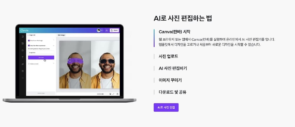
AI의 기술이 발전하면서 AI를 활용한 다양한 이미지 도구가 나오고 있는데요. 이번 글에서는 무료로 사용 가능한 AI 편집 도구인 캔바(Canva)를 이용한 AI 이미지 편집 쉬운 방법을 알아보겠습니다. AI 이미지 편집 쉬운 …
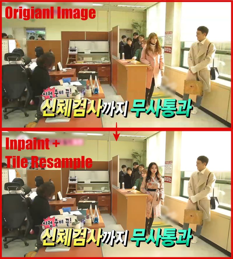
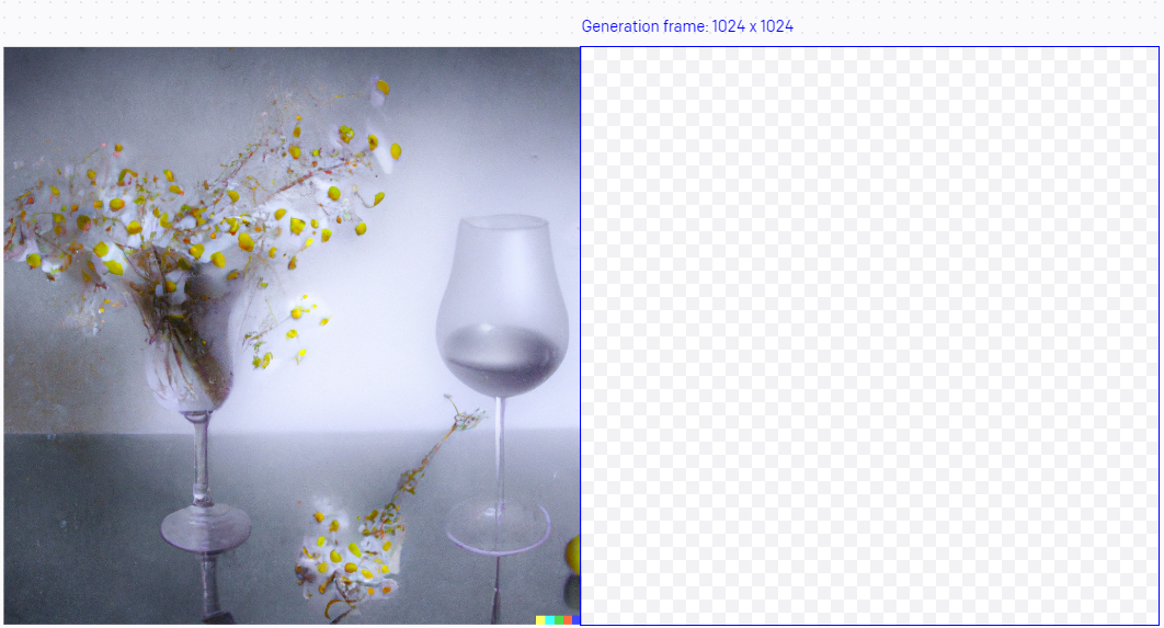
본 글에서는 스테이블 디퓨전의 타일 리샘플 기능에 대해 자세히 살펴보고자 합니다. 사진기가 발명되기 전 인류는 오랜시간 현실을 가장 현실적으로 표현할 수 있는 기술을 갖기 위해 그림실력을 키워왔습니다. 물론 사진기가 발명된 …
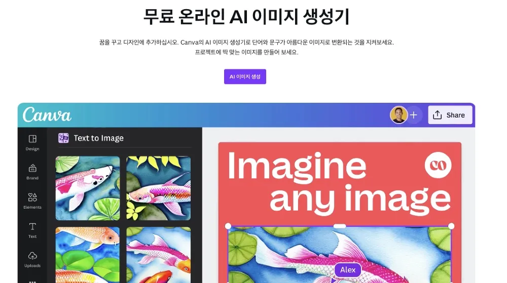
텍스트를 AI 이미지로 변환해주는 사이트는 여러 군데가 있는데요. 오늘은 그 중에서도 캔바(Canva) 사이트를 이용해서 텍스트 기반 AI 이미지 생성 방법에 대해서 알려드리겠습니다. 캔바는 무료로 사용 가능한 디자인 도구 프로그램입니다. 텍스트 …
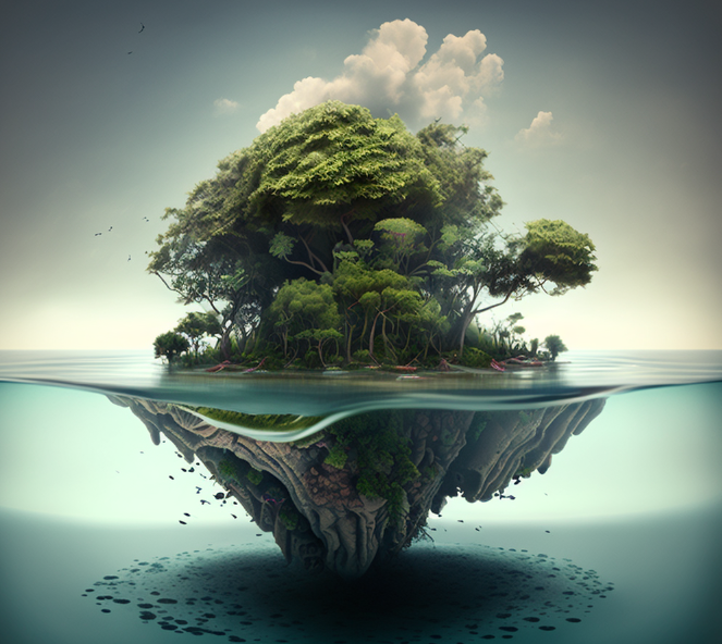
아직 현실세계에 살고 있는 우리에게 AI는 상상력과 가상공간이란 무한한 창작 캔버스를 제공해주고 있습니다. 이 공간에서 우리는 머리 속으로만 그려왔던 많은 상상을 실제 눈으로 보이는 이미지로 만들어 낼 수 있다는 점에서 …

AI 이미지 다운로드 방법에 대해 자세히 알아보겠습니다. 최근 AI 기술의 발전으로 이미지 다운로드 방법에도 혁신적인 변화가 있었습니다. 이 글에서는 AI 기술을 활용하여 이미지를 효과적으로 다운로드하는 방법을 소개하겠습니다. 더 나아가, 웹 …