라임와이어 무료 AI 이미지 생성 방법
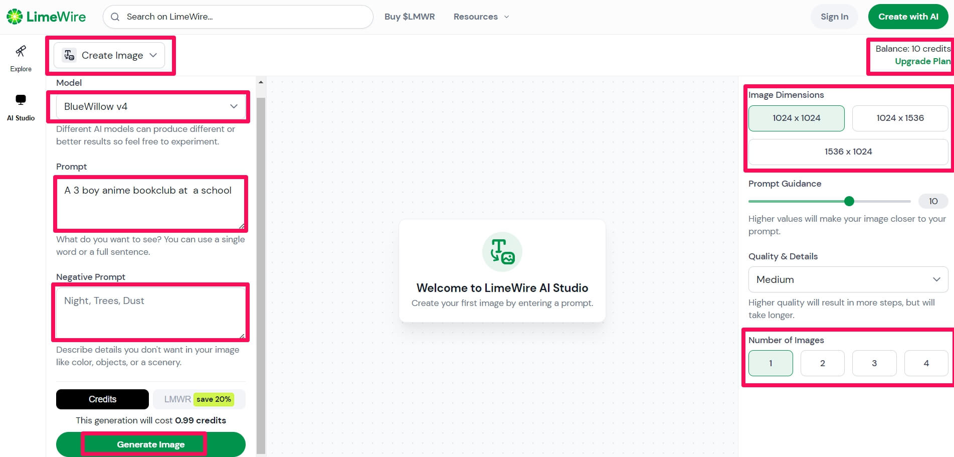
라임와이어는 블루윌로우를 무료로 이용할 수 있는 사이트의 이름입니다. 블루윌로우는 원래 가입 후 25개의 이미지를 생성할 수 있었는데요. 요번에 정책이 바뀌면서 디스코드에서는 유료 구독자만 무료 AI 이미지 생성이 가능하고 무료 이용은 …

라임와이어는 블루윌로우를 무료로 이용할 수 있는 사이트의 이름입니다. 블루윌로우는 원래 가입 후 25개의 이미지를 생성할 수 있었는데요. 요번에 정책이 바뀌면서 디스코드에서는 유료 구독자만 무료 AI 이미지 생성이 가능하고 무료 이용은 …
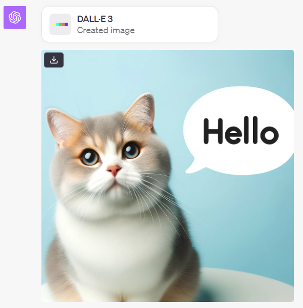
드디어 챗GPT로 AI 이미지를 생성할 수 있게 되었습니다. 플러스 구독자를 대상으로 dall-e3를 챗gpt상에서 이용할 수 있게 되어서 챗gpt에서 대화하면서 이미지 생성과 수정이 가능해졌습니다. 사람마다 오픈되는 날짜는 다소 차이가 있었는데요. 저는 …
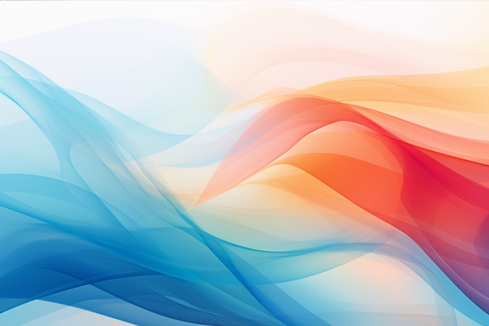
배경 이미지는 다양한 종류가 있는데요. 그림 그리는 ai를 이용하면 쉽게 저작권 제약 없는 배경을 생성할 수 있습니다. 아래에서 ai 배경 그리는 방법을 알아보겠습니다. 백그라운드 배경 종류 미리캔버스 기여자 기준으로 배경 …
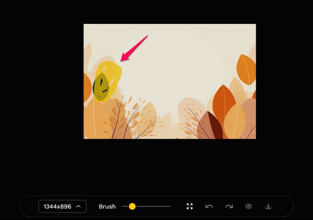
ai 이미지를 생성하면 한번에 마음에 드는 경우도 있지만 일부가 이상하거나 마음에 들지 않는 부분도 있을 수 있습니다. 아래에서는 ai 이미지 편집하는 방법에 대해서 알아보겠습니다. ai 이미지 편집 ai 이미지를 편집하고자 …
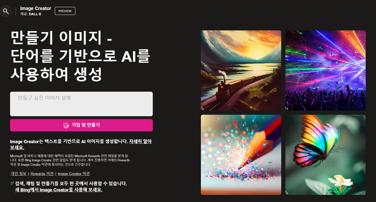
빙 이미지 크리에이터는 Dall-E를 기반으로 한 AI 이미지 생성 사이트인데요. 무료 이용이 가능하고 사용법이 쉬운 AI 사진 사이트입니다. 아래에서 사용법을 살펴보겠습니다. 빙 이미지 크리에이터 가입 https://www.bing.com/create 에서 이미지를 생성할 수 …
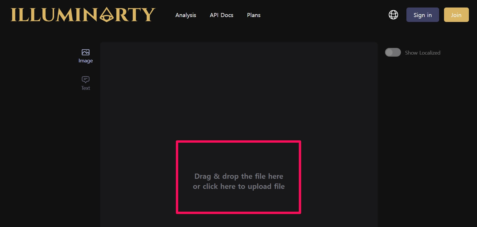
ai 그림 구별 사이트에서 ai 그림과 제가 그린 그림을 넣어서 구분을 잘 하는지 직접 살펴보고 ai가 그린 그림은 어떤 특징이 있는지 제 개인적인 경험도 나눠보겠습니다. ai 그림 구별 사이트 일루미나티로 …
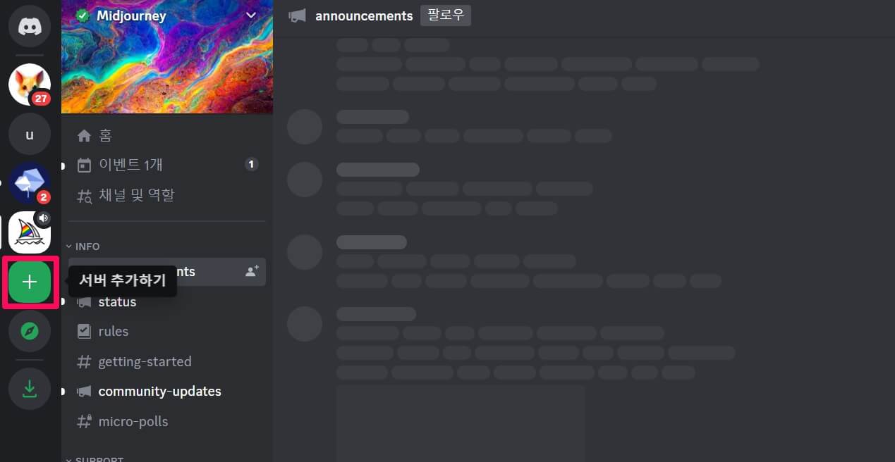
미드저니를 처음 이용하는 분들은 공개채널에서 이미지를 만들다 보면 자꾸 내가 만든 이미지가 위로 올라가서 찾기 불편하고 다른 사람들이 내가 만든 이미지를 볼 수 있다는 점이 약간 불편할 수 있습니다. 미드저니 …
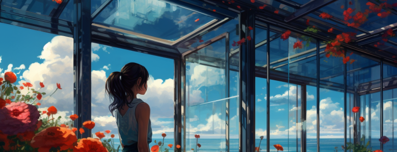
미드저니는 AI 그림 생성 사이트로, 텍스트 입력을 기반으로 이미지를 생성해줍니다. 사용자들이 텍스트로 원하는 이미지에 대한 설명을 입력하면 AI가 대신 그림을 생성해주는데요. 미드저니 가입 및 AI이미지 만드는 방법을 알아보겠습니다. 미드저니로 AI …

ai 그림 사이트에 대해서 알아봤었는데요. AI 그림 무료 사이트를 이용하여 이미지를 생성하면 창의적이면서 내가 원하는 이미지를 저작권의 구애를 받지 않고 손쉽게 만들 수 있습니다. 여러 사이트 중에 제가 개인적으로 추천하는 …
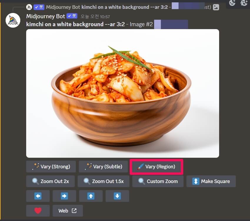
미드저니에서 김치 스톡사진 만드는 방법에 대해서 알아보겠습니다. 김치는 왠지 우리나라 음식이라서 외국 AI이미지 생성 사이트에서 생성이 안 될 것 같다는 생각이 들 수 있는데요. 결론적으로 이야기하면 잘 만들어줍니다. 아래에서 생성하는 …