벡터 이미지 알아보기 (AI, EPS, SVG 등)
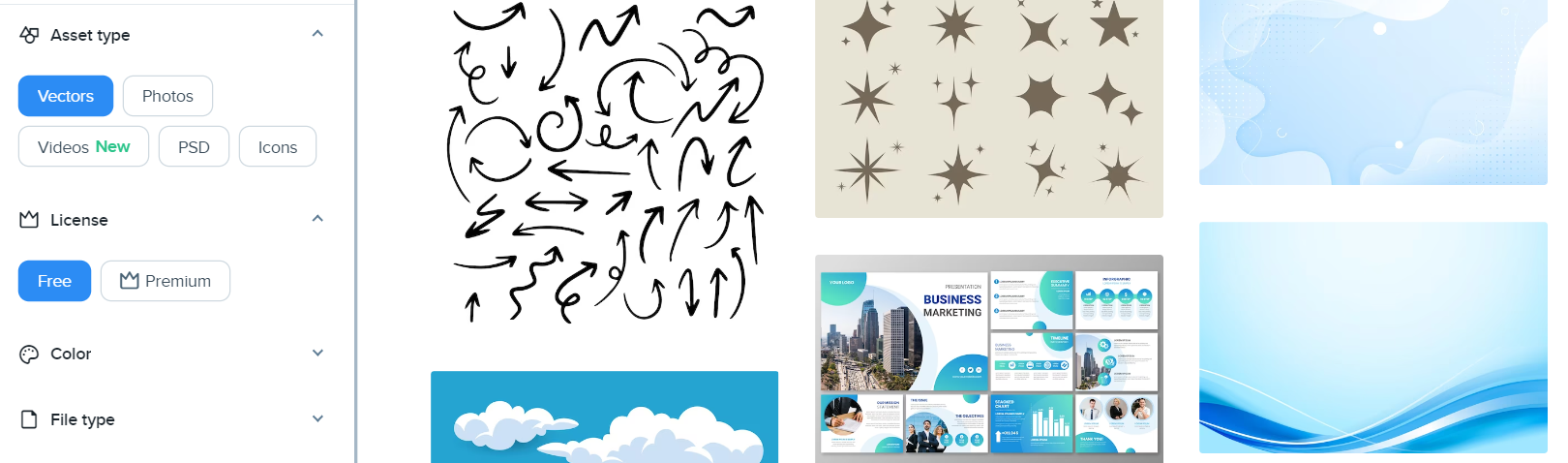
벡터 이미지가 무엇인지 알고 계신가요? 간혹 디자이너에게 AI 파일을 받고 이걸 어떻게 열어야 하는지 난감했던 경험이 있을 수 있는데요. 이 글을 통해 생소했던 Vector 이미지에 대한 모든 것을 알아보세요. 벡터 …

벡터 이미지가 무엇인지 알고 계신가요? 간혹 디자이너에게 AI 파일을 받고 이걸 어떻게 열어야 하는지 난감했던 경험이 있을 수 있는데요. 이 글을 통해 생소했던 Vector 이미지에 대한 모든 것을 알아보세요. 벡터 …
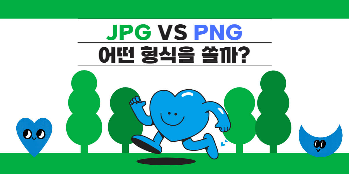
이미지 검색 시 JPG와 PNG 2가지 종류의 디지털 이미지 형식을 가장 많이 볼 수 있는데요. 그 차이점은 무엇인지 알고 계신가요? 아래에서는 가장 대중적인 이미지 형식인 JPG와 PNG 차이에 대해 살펴보고 …
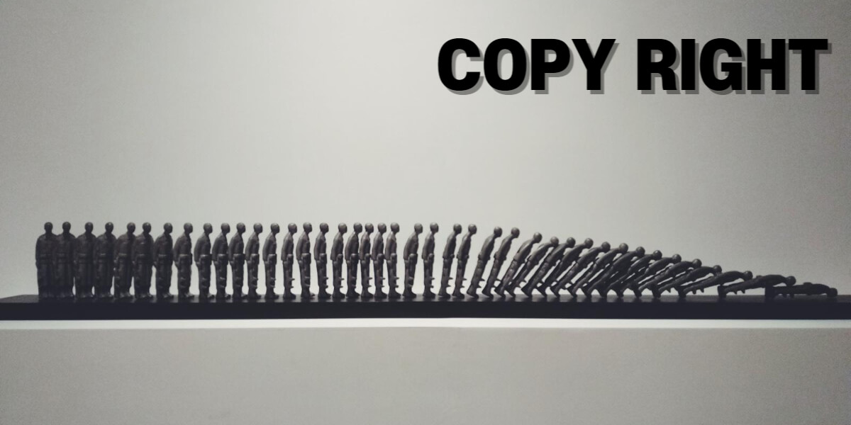
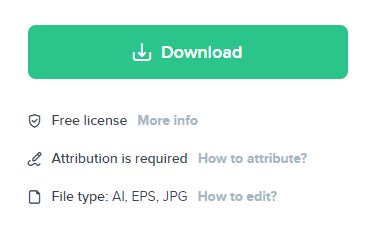
이미지는 디지털 시대에서 누구나 접할 수 있는 중요한 콘텐츠입니다. 하지만 이미지를 사용할 때 저작권을 준수해야 한다는 사실을 잊어서는 안 됩니다. 이미지 저작권은 창작자에 대한 권리를 보호하는 법적 개념입니다. 이 글에서는 …
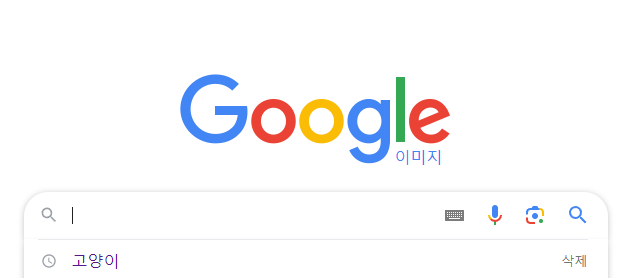
구글 이미지 검색은 구글에서 제공하는 서비스로 PC 검색뿐 아니라 모바일에서도 쉽게 할 수 있습니다. 아이폰, 안드로이드 폰으로 쉽게 이미지 검색하는 방법에 대해서 살펴보겠습니다. [아이폰 사진 구글링] 사파리 앱으로 구글 이미지 …
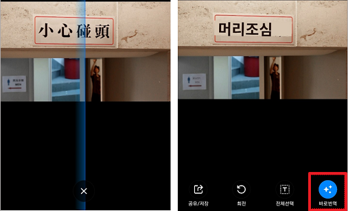
모바일 이미지 번역은 여행할 때 특히 유용한 기술입니다. 사진이나 이미지 속에 포함된 텍스트를 실시간으로 번역하여 다른 언어로 이해할 수 있게 해주는 기능을 제공하는데요. 이를 통해 해외 여행이나 외국어로 된 문서의 …
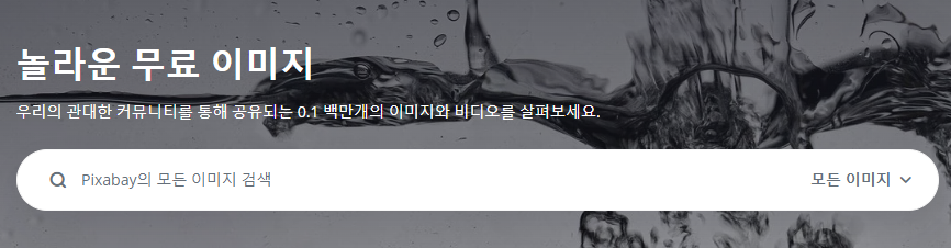
고화질 이미지 무료로 다운로드할 수 있는 사이트는 다양한 프로젝트나 디자인 작업에 필수적입니다. 이 기사에서는 고품질의 무료 이미지를 제공하는 다양한 사이트를 소개하고, 각 사이트의 특징과 이용 방법에 대해 알아보겠습니다. 픽사베이- 고화질 …
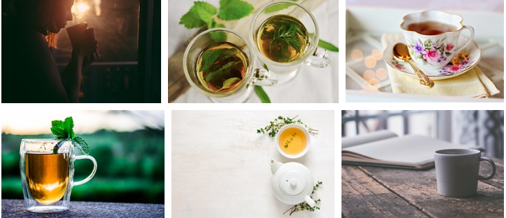
픽사베이(Pixabay)는 다양한 크리에이터들이 무료로 이미지, 동영상, 음향 등의 콘텐츠를 공유하는 커뮤니티입니다. 픽사베이에서 제공되는 콘텐츠는 픽사베이 저작권에 따라 사용자들이 저작권에 대해 걱정하지 않고 자유롭게 활용할 수 있는데요. 아래에서 자세히 살펴보겠습니다. 픽사베이 …
인터넷에서 무료로 사용할 수 있는 일러스트 이미지를 찾는 것은 디자이너와 창작자들에게 큰 도움이 됩니다. 특히 일러스트 이미지는 웹사이트, 블로그, 소셜 미디어 포스트 등 다양한 컨텐츠에 활용될 수 있는데요. 이 글에서는 …
이미지 용량 줄이기는 웹사이트 속도와 성능 향상을 위해 필수적인 단계입니다. 대용량 이미지는 페이지 로딩 속도를 늦추고 사용자 경험을 저하시킬 수 있기 때문입니다. 따라서 이미지 용량을 효과적으로 줄이는 방법과 그 도구를 …
이미지를 동영상으로 변환하는 방법에 대해서 검색하면 대부분은 이미지를 살아움직이는 동영상으로 만드는 방법이 아니라 이미지를 넣어 동영상을 만드는 방법으로 알려줍니다. 물론 유튜브 영상들을 보면 이미지를 이용하여 만든 동영상들도 많은데요. 그런 것들이 …